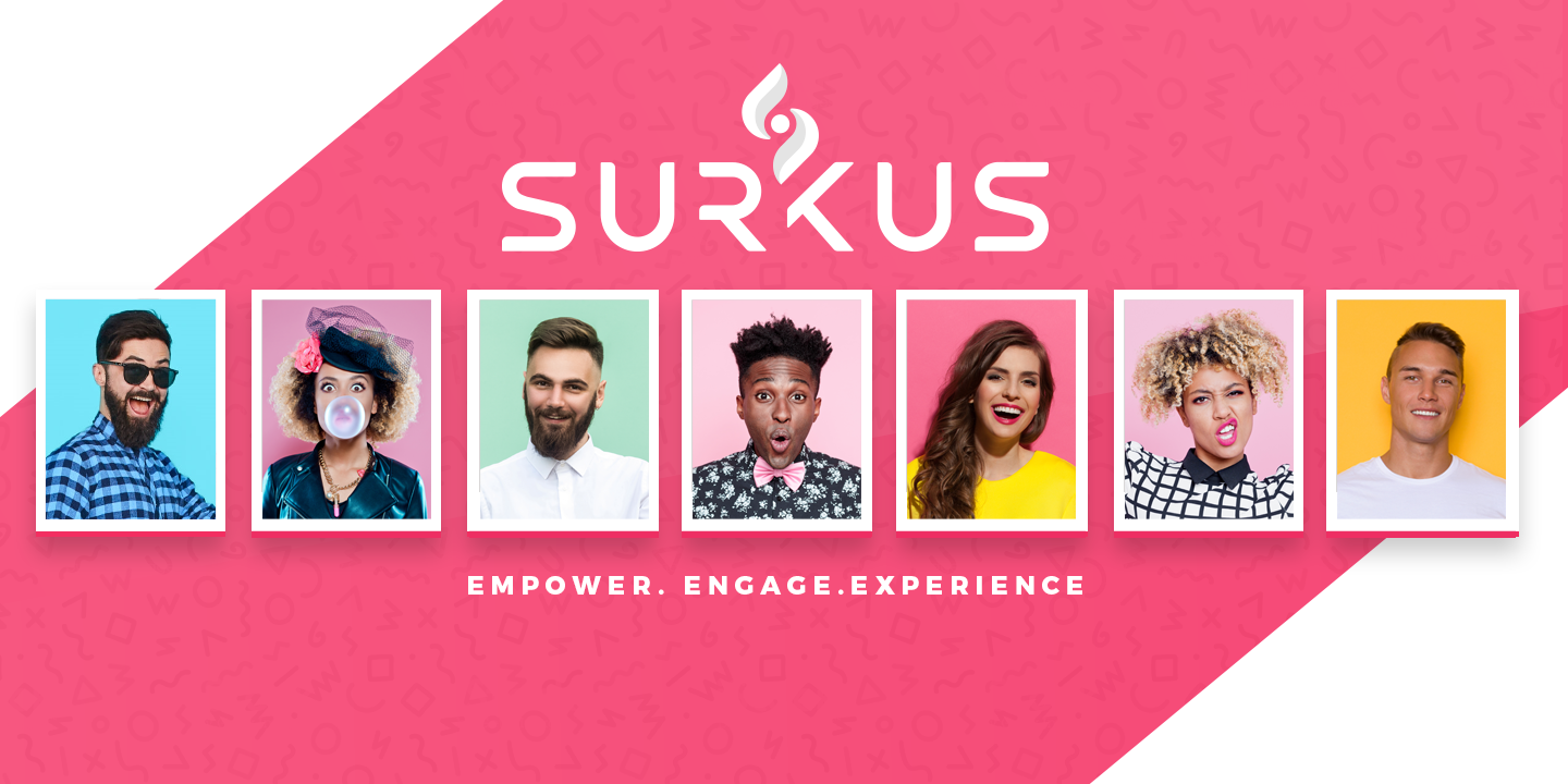
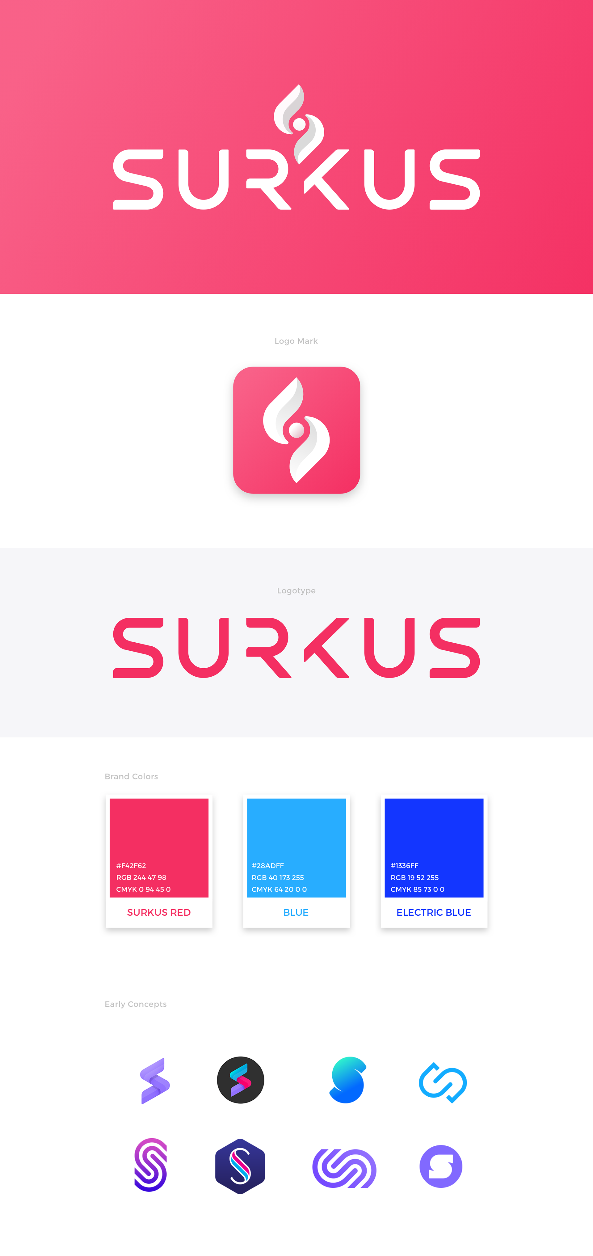
Visual identity: Fun, Fresh & Vibrant
Aiming for a fresh modern look, I designed a custom uppercase san serif font. As I started deleting some of the stems from the center letters the logotype became more interesting and stylish while still maintaining visual balance and readablilty.
The Surkus mark has an energetic intertwining vortex and flame-like quality that represents the vibrant and fun energy at Surkus events. The negative space and circle in the middle represents a location marker. Considering Surkus is primarily an event based app I thought it was only fitting to play off a location marker without being too obvious.
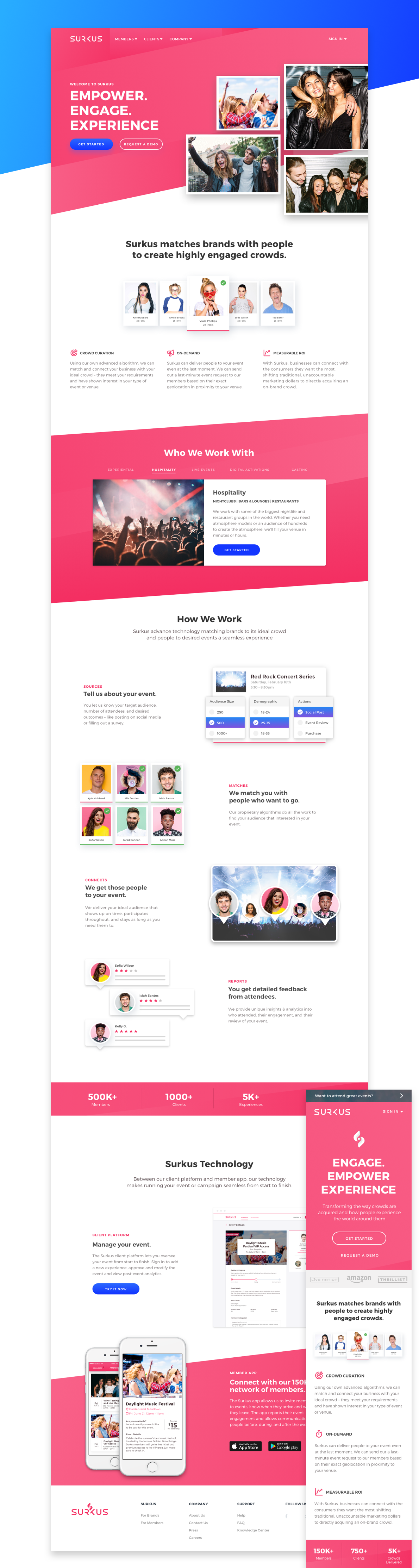
Marketing landing page
Clear consistent brand messaging and value proposition was key to accomplishing the main goal of any landing page, improved customer conversion. Bringing people and crowds to the forefront along with a vibrant color palette helped communicate that Surkus is all about fun experiences.
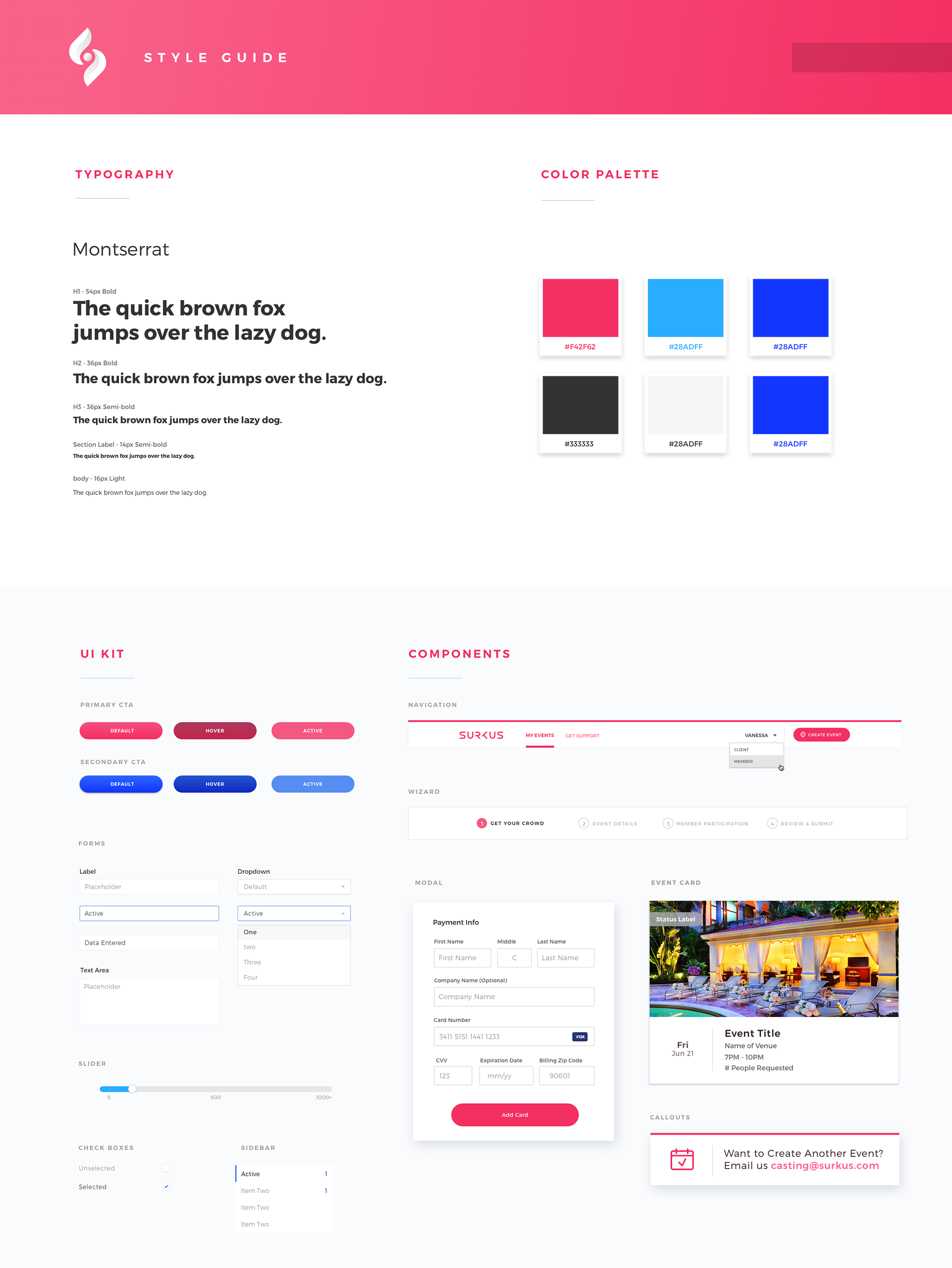
Documenting styles
A Style guide is key to creating a consistent brand experience throughout all digital platforms and products. The guide also included web components for the dev team to reference when building out new features.