
Collaboration
As the lead product designer, I worked closely with the product and tech leads for both app and growth teams. We had weekly checkins, brainstorm sessions, and reviews. The team always provided great insight and feedback as we continued to iterate on design and UX. Once we were happy with the overall direction and ready to build out a prototype for user testing - I had the pleasure to work with our super talented research and UX copywriting teams to prepare the For You experience for user research.
The Challenge
In late 2019 working with the growth team as a lead designer, we completely revamped the TM app onboarding experience to focus on personalization. By asking fans to let us know who their favorite artists and teams are we could better recommend upcoming events.
With the launch of the new onboarding experience, we saw a 496% increase in added favorites. Although it was great to see the increase in user data, we noticed that most fans on average only added 3-5 favorite artists/teams. Considering that most artists are on tour for only part of the year and sports have an off-season - the average fan did not see a lot of content in the favorites section of the app.
Problem: The favorites tab only showed events from favorited artists & teams and had no way for fans to discover anything new.
Solution: Create a more content-rich and engaging personalized experience with smart event recommendations based on user's favorite artists and teams.
Solution: Create a more content-rich and engaging personalized experience with smart event recommendations based on user's favorite artists and teams.
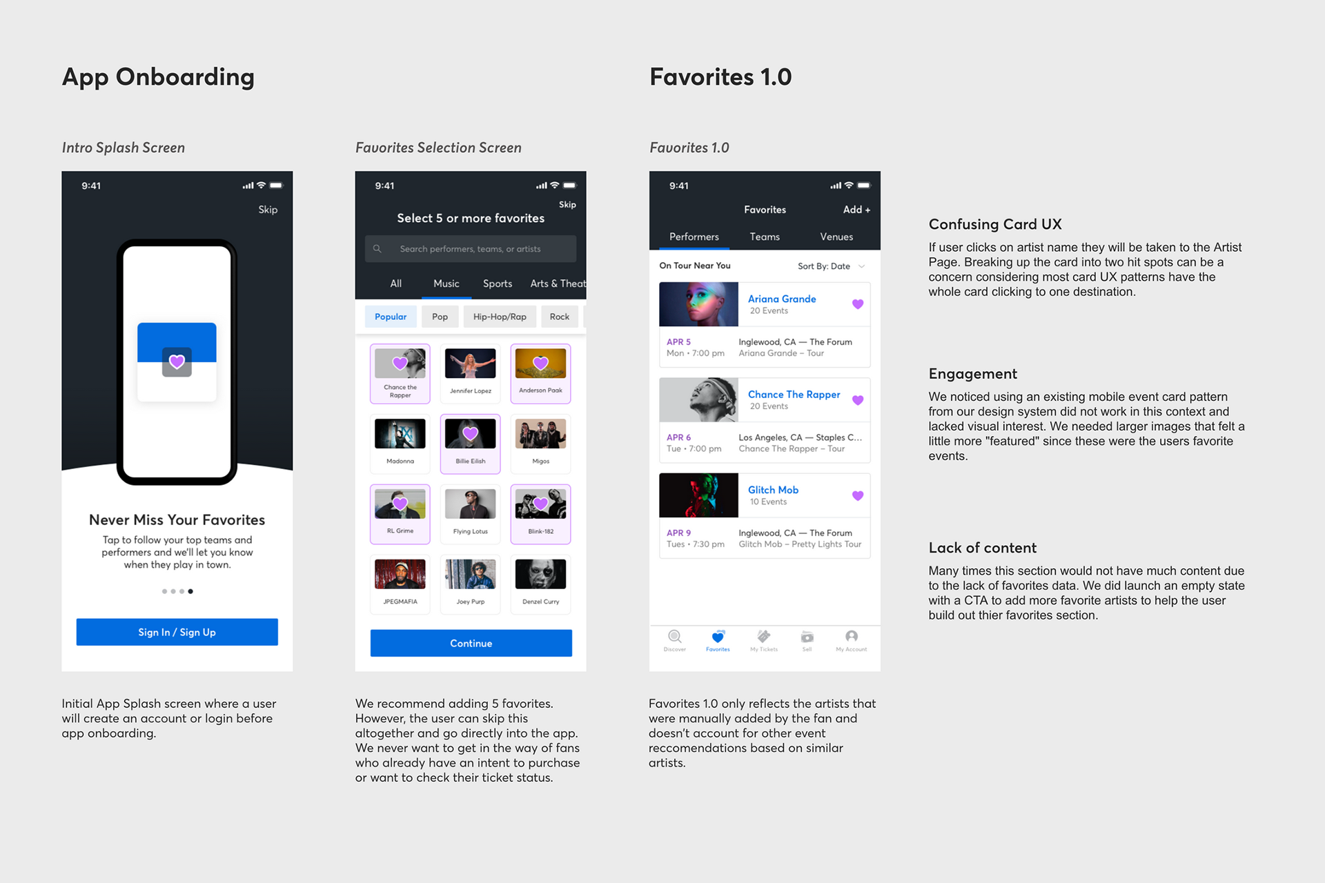
Favorites 1.0 launched in 2019
Reimagining Favorites 2.0
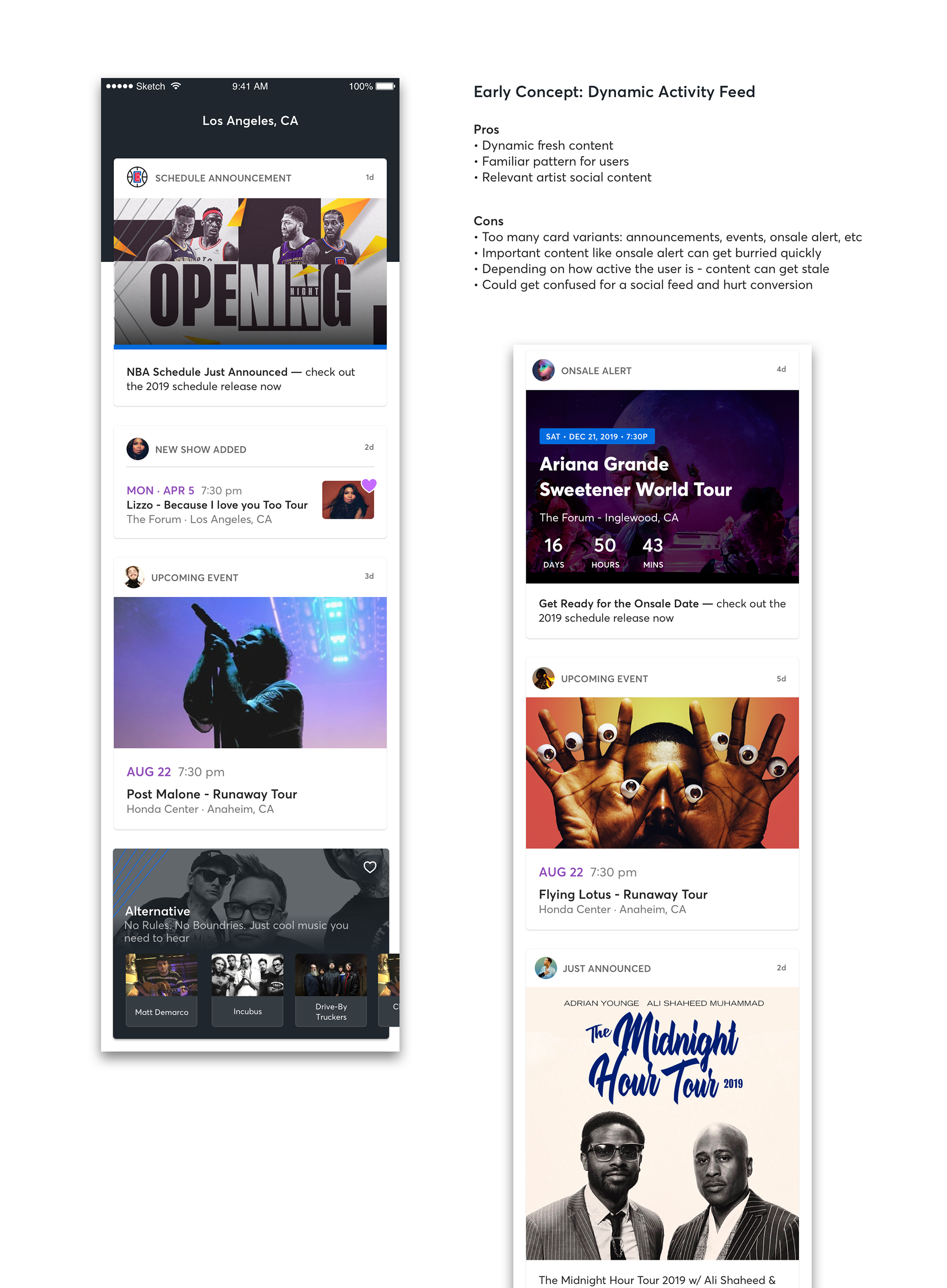
As a team, we scheduled a couple of brainstorming sessions on how we could create a more engaging personalized favorites experience. We approached the session as if we had no product or tech limitations. Various ideas came up like turning the favs section into an activity feed that would showcase your favorite artist music, videos, and social feeds along with upcoming events to allow the fan to feel closer to the artist. However, at the end of the day, we are a ticketing site and we shouldn't lose focus on our core value and why fans come to Ticketmaster.
Solution: Make it Smarter
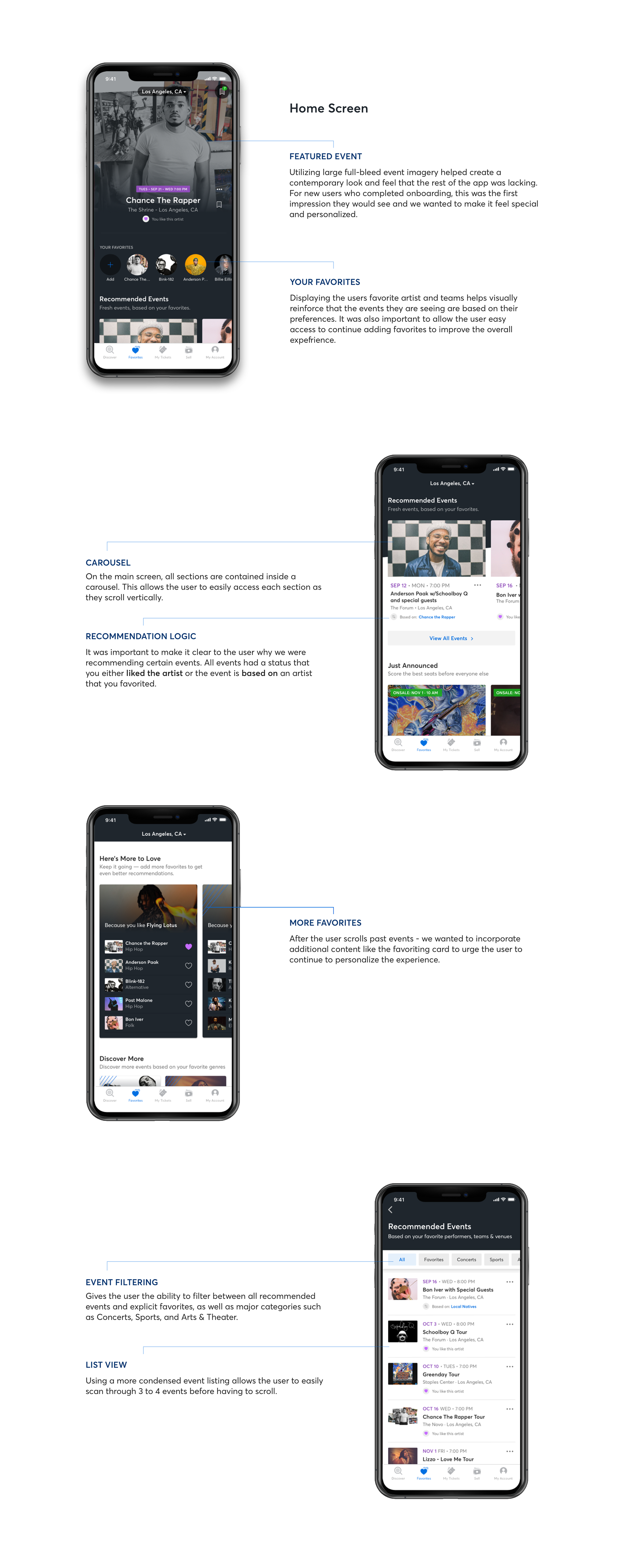
To evolve the favorites section and provide more relevant event recommendations we needed to not only show favorite artists but similar artists as well. By integrating, the preference API it would allow us to tie 15-20 similar artists to one favorite artist and help create a fresh personalized experience and showcase more events. Ultimately we decided to rename the section "For You" since we were moving beyond a typical Favorites experience that was common in most apps.
We moved away from the activity feed concept and went with a more contemporary look and feel that placed emphasis on recommended events. The UI is designed to scale, with the ability to add additional carousels of content, as sections evolve. Through user research, we iterated on the content that was most valuable, leading to the information architecture and the core features you see below.
We moved away from the activity feed concept and went with a more contemporary look and feel that placed emphasis on recommended events. The UI is designed to scale, with the ability to add additional carousels of content, as sections evolve. Through user research, we iterated on the content that was most valuable, leading to the information architecture and the core features you see below.
User Research and Interviews
I worked closely with our research team to create a testing script and recruit 5 participants for our moderated user research. Sessions were 30 min and conducted using the validately platform. We wanted to test active users so in order to qualify they must have purchased 3+ concerts in the past year on any ticketing app.
Goals
Users want to see events presented in order of timeliness and urgency. For recommended events, users preferred to see events sorted by date on land.
Goals
Understand users’ overall perception and understanding of recommended events and the logic behind them in an app prototype
Test order of events. Chronological vs Relevance
Key Findings
Users understood the logic behind recommended events. When asked to identify the source of recommended events presented, they were able to distinguish recommendations made based on favorites or similar artists.
"Because it says recommended events based on my favorites, I see the events show whether or not I favorited this person or I might like this person based on so and so artist that I favorited. "
Users want to see events presented in order of timeliness and urgency. For recommended events, users preferred to see events sorted by date on land.
“How do they determine the relevance? Is it because I really like this artist at the top and that would be the most relevant? Whereas date, it’s like a more concrete way to plan things. I would definitely prefer the date.”
You can view the prototype used for research here
You can view the prototype used for research here
Delivering the MVP
After a couple more rounds of revisions based on user feedback, we were able to land on an MVP version of the experience. After assessing the level of effort with engineering we stripped out some features - to align with our roadmap and deliver the core experience on time.
The lead developer was heavily involved in the entire process. I made sure to always give him heads up on the latest iteration to make sure our vision was realistic and could be developed on time. User flows, Invision prototypes, Figma interaction animations, and Zeplin files were all handed off to the dev team.